

Standing out in the digital world can be difficult, so you need to do everything you can to make the right impression. And what’s your biggest online touchpoint? Your website. The window to your business and often the first point of call for prospective and current clients, making a strong impression with your website is crucial.
But what exactly makes a ‘good’ website? Well, there are a few core elements that should always be considered, including:
- A clear, well-organised structure
- Easy-to-use site navigation
- High-quality, relevant content
- On-brand design
- Optimised speed
- Mobile-friendly
To demonstrate what these things look like in action and to give you some inspiration for your own website, here are 3 examples of really great accounting websites:
City Tax Accountants
With a clear two-sided CTA (call to action) above the fold which motivates users through concise copy, engaging on-brand colours and clickable buttons, the purpose of City Tax Accountants site is obvious from the get-go. They are here to drive business – and you should be too.
To further encourage users to take action, they include persuasive copy that expresses their value whilst highlighting their relevance to their target audience.
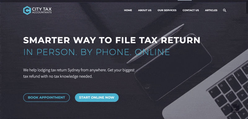
As you continue down their homepage, they make use of whitespace, graphics, headlines, animations and CTA buttons to engage users and draw them to key information. They ensure to include important information, such as contact details, service offerings and social proof (client testimonials), in a visual format to convey required information without overwhelming or losing the interest of their audience.
Their navigation is simple and well organised, enabling users to quickly access key pages no matter where they are on the site. They also offer a search function to allow users to find relevant pages efficiently and easily.
Bromhead
Looking for a way to make your homepage more engaging? Why not take inspiration from Bromhead and kick things off with an explainer video? With 84% of people agreeing they are more likely to do business with a firm after watching one of these, it seems like a no-brainer.
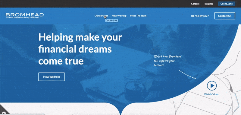
With their simple navigation, strong branding, clear CTAs and engaging layout, it’s certain Bromhead knows how to nail a website. By using graphics, diagrams and colour blocking they are able to educate their audience whilst keeping them engaged and motivating them to take action. This site proves accounting firms can be fun and is the perfect example of why you should be willing to think outside the box if you want to be remembered.
Swallow Accountancy
From the moment you enter their site, Swallow Accountancy will have your attention thanks to their use of bright on-brand colours and simple (yet highly effective) animations. Again, they use headers, whitespace, imagery, CTA buttons and colour blocking to break up text and keep the site looking clean.
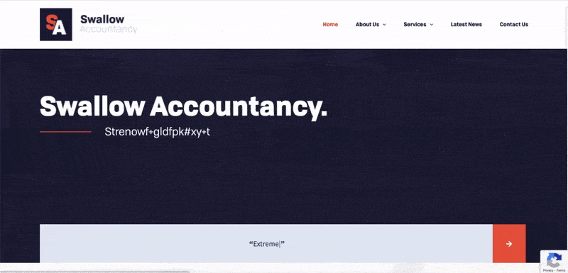
They include simple forms to make enquiries hassle-free and keep the user experience simple by including a well-structured navigation menu, fast loading pages and plenty of relevant CTAs.
So, there we have three websites to help inspire your accounting firm. If you are looking to upgrade your website, contact us for a free consultation to discover how we can help you to create a site that sells or head over to our website design for accounting firms page to learn more about our services.