

All too often, decisions over typeface seem to be based on little more than what feels right. A degree of subjectivity in all aspects of design is inevitable, but I do believe that (as with colour) creativity at its best is built on a foundation of facts and logic. That’s why I’ve trawled through the ocean of detailed but chaotic information on the web and created a simple guide to selecting typeface for business.
Definitions
Developing an understanding of typeface at times feels a lot like learning a second language. Here are some of the more common terms that you’ll need to get familiar with:
- Font – each typeface has a family of fonts – bold, italic, etc.
- Stroke – any line within the letter.
- Stem – the main vertical stroke.
- Kerning – the process of adjusting letters so that the white space between them feels comfortable on the eye and optimises legibility.
- Stress – the way it leans.
- Serif – the little flick that appears on the end of some letters. As we will see, this little flick defines a whole family of typeface.
- Axis – an imaginary line drawn from top to bottom of a letter that shows the degree of stress (how much it leans).
- x height – literally the height of a little x. A term used to refer to the bottom half of your type.
- Brackets – a curved or wedge-like connection between the stem (main vertical line) and serif (little flick) of some typefaces.
- Baseline – the imaginary line the letters are sat on.
- Glyph – the variety of designs of a certain character. If you have 3 different designs of the letter A, for example, you have 3 glyphs.
- Aperture/Counter – a bit of space partially or entirely closed, such as in an n, s or c. The larger and more open it is, the better for legibility.
- Ascender – the bit that rises above the x height.
- Descender – the bit that drops below the baseline.
- Apex/Vertex – the top and bottom points where two strokes meet.
- Terminal – the end of a stroke (but not a serif).
- Hairline (or hair stroke) – a thin stroke, commonly found in serif typefaces.
- Legibility vs readability – legibility is concerned with the details of individual letters, while readability is concerned with the overall appearance of whole bodies of text. It is a very small distinction (illegible letters cannot be made into readable words) and in this guide I’ll be using them pretty much interchangeably.
Serifs
We’ll begin with the serif, which applies to those typefaces that have a little flick on the end of the letters. They are generally considered traditional and often found in books.
Old Style (Humanist)
Origins – Popular from the 15th century to the 18th century, these are typefaces based on the scripture of Ancient Rome and are sometimes also known as humanist serifs due to the fact that they represent a natural (human) stroke.
Design – the serifs are bracketed, the axis tends to be curved to the left, the x-height is small and there is little contrast between the thick and thin strokes. They sometimes have a diagonal cross stroke across the e, as that’s naturally how a person would write.
Examples – Garamond, Goudy Old Style, Centaur, Perpetua and Minion Pro.
What it communicates about a brand – it communicates tradition, history, conservatism and reliability.
Legibility – their simple and natural style assists in legibility although this can be offset slightly by their small x height (which reduces the size of the counters).
Transitional
Origins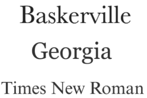 – John Baskerville, the English printer, established this style in the 18th century. It includes elements of both the old style and the neoclassical designs that followed.
Design – There is no sense of it being handwritten, with the stress perfectly vertical, weight contrast is pronounced and serifs tend to be bracketed. The curvature of serifs is more gradual. It is elegant and sharp.
Examples – Baskerville, Georgia, Caslon and Times New Roman.
What it communicates about a brand – like old style, it can communicate tradition but with a greater elegance. It is commonly used within law and academics. Baskerville in particular is considered an extremely trustworthy typeface as many believe it presents a certain British formality.
Legibility – generally considered highly legible.
Neoclassical (also known as didone or modern)
Origins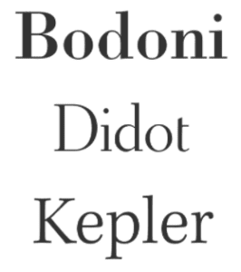 – created in the late 18th century, it represented a significant shift from previous typefaces. The classification name Didone is a combination of the names of the two most common modern fonts at the time – Didot and Bodoni.
Design – vertical axis, high contrast between thick and thin strokes, and flat, hairline serifs. Tends to be little or no bracketing.
Examples – Bodoni, Didot, Elephant and Kepler.
What it communicates about a brand – sophisticated but could be considered cold. Regularly used by fashion brands and magazines.
Legibility – tend to be distinctive but harder to read, making them great for headlines but not body copy. Dazzling can occur where thick lines become prominent and thin lines almost disappear.
Slab (often called square or egyptian):
Origins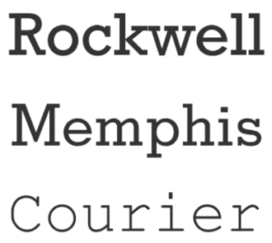 – this style first appeared in the nineteenth century as the printing of ad material was expanding and it offered a more attention grabbing appearance.
Design – geometric, block like appenditures. Very solid and confident. They have minimal or no bracketing, and heavy serifs. Stroke contrast is minimal.
Examples – Rockwell, Courier, Beton, Tower and Memphis.
What it communicates about a brand – it communicates confidence, strength and durability. They tend to be authoritative but still friendly. Courier in particular is typically regarded as the typeface of nerds and librarians.
Legibility – generally considered highly legible as they benefit from strong serifs while still offering a high contrast that we’d usually associate with sans serif typefaces. They produce extremely well defined lines of text.
Glyphic:
Origins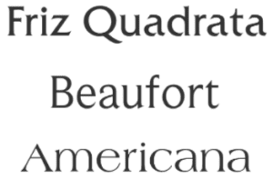 – they are derived from engraved letters, so appear like they’ve been created with a chisel rather than a pen.
Design – contrast in stroke weight is minimal. The defining feature os the triangular shaped serifs and the flaring of the strokes when they terminate. Sometimes only contain uppercase. The axis is vertical.
What it communicates about a brand – tradition and strength. Often used by luxury brands and products with a high price point.
Examples – Trojan, Beaufort, Americana and Friz Quadrate
Legibility – legibility can be quite variable. Counters can be small and some glyphic typefaces only appear in upper case. They tend to be used more for display type than body copy.
Sans serifs:
The sans (or “without” in French) means that there is no serif, or finishing stroke. This simplicity creates a more modern feel and is a little more common on the web.
Grotesque:
Origins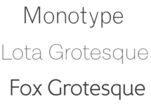 – it was the first sans serif to be popularised and use lowercase. It began with Caslon (William Caslon IV) and they were called grotesque because they were considered quite ugly compared to their more ornate serif predecessors.
Design – Influenced by Didone serif fonts of the period, these were often quite solid, bold designs suitable for headlines and advertisements. They are generally very similar to serif typefaces.
What it communicates about a brand – an informal warmth. Smooth and balanced.
Examples – Quartz grotesque, Ideal Grotesk, Akzidenz-Grotesk and Monotype Grotesque.
Legibility – very strong due to its simplicity and large apertures.
Neo grotesque:
Origins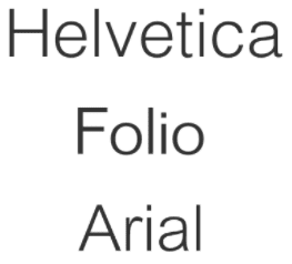 – a direct evolution from grotesque, it began in the 1950’s with the aim of creating rational, almost neutral typeface designs.
Design – They have a relatively plain appearance in comparison to grotesques. Less variation and irregularity.
Examples – Helvetica, Folio, Arial, Univers and Roboto.
What it communicates about the brand – modern, safe, perhaps a little generic. Great for body copy, hence why Arial and Helvetica are the two most common typefaces on the web.
Legibility – tend to be highly legible. In fact Helvetica is believed to be the best typeface for people suffering from dyslexia.
Geometric:
Origins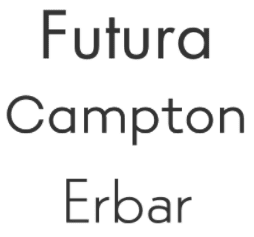 – it originated in Germany in the 1920’s and remained popular throughout the 30’s. Various revivals have been made since.
Design – based on geometric shapes, mono linear lines and circular shapes. It is very simple and very modern.
Examples – Universal, Erbar, Proxima Nova and Futura.
What it communicates about a brand – it suggests the brand is modern, open and transparent. Great for tech companies.
Legibility – not often used as body copy as the letterforms tend to not be too distinct, but great for headings.
Humanist:
Origins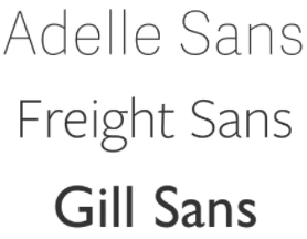 – emerged in early 20th century, essentially carrying over all the principles of humanist serif type over to sans serif.
Design – more calligraphic than other sans serifs so they have a greater variation in line widths and sometimes even have a slight stress, giving the more natural appearance of how someone would actually write. The lowercase a and g tend to be two story.
Examples – Frieght Sans, Adelle Sans, Gill Sans, Geneva, Tahoma and Verdana.
What it communicates about a brand – it communicates a more natural, human and personal tone.
Legibility – these are highly legible as they have high stroke contrast and highly distinct letterforms.
Script:
This class includes all those that appear handwritten, often calligraphic, and give a sense of style and elegance. In an experiment, diners were presented with two menus, one using fancy script typefaces and one using plain, sans serif type faces, and they assumed that the chef behind the menu with script type possessed greater skill than the other. However, greater complexity isn’t always the right message for a brand to communicate!
Formal:
Origins – they are based on 17th and 18th century letterforms and created by a quill or metal nib.
Design – there is a high contrast between fine and thick strokes, and the letters often join together. They are commonly found in wedding invitations and certificates as they give an almost stately appearance.
Examples – Snell Roundhand, Compendium, Ambassador and Balmoral.
What it communicates about a brand – elegance, formality, tradition, opulence.
Legibility – tend not to be legible so use should be limited to large header and display copy.
Blackletter and lombardic:
Origins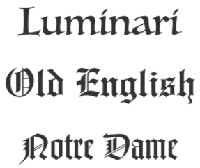 – was used in the Guthenburg Bible and its appearance immediately conjours up thoughts of Medieval Britain. It was common from the 12th century across western europe and in Germany right up to the 20h century, and is often associated with Nazi propaganda.
Design – dramatic thin and thick strokes, elaborate serifs
Examples – Frakto, Notre Dame, Old English and Luminari.
What it communicates about a brand – it communicates history and tradition, but also strength and mystery. Often used by heavy metal bands (also Corona, Disney).
Legiblity – legibility is poor which is why it soon went out of fashion as body type and is now only used for headings and logos.
Casual:
Origins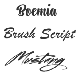 – they emerged in the early 20th century and then became increasingly popular in the 50’s and 60’s.
Design – they appear as if drawn quickly and tend to be loose and informal with the appearance of having been painted with a wet brush rather than via a nib.
Examples – Brush Script, Kaufmann, Swing and Mistrai.
What it communicates about a brand – gives an informal, relaxed and even intimate appearance.
Legibility – legibility is often poor so should be limited to large header copy.
Display/Decorative:
Origins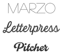 – became popular in the 19th century and was often used on posters and in ads as it was considered more exciting than previous typefaces.
Design – as their name suggests, they are highly deocaraitve and therefore should be used carefully and sparingly. They come in a vast array of styles. The only common theme being that they tend to stand out and grab people’s attention.
Examples – Estilo, Marzo, Letterpress and Pitcher.
What it communicates about a brand – the great thing about decorative fonts is that anything is possible. They can communicate far more than conventional type faces as there are no limits, as illustrated by some of the examples here.
Legibility – these fonts are not intended for body copy. They should only be used for type over a certain size such as for headers or posters.
General rules about body copy
- Font should be kept between 8pt to 10pt.
- Font should always be left aligned and jagged on the right.
- Always favour lower case.
- Lines should be 50-60 characters wide, including spaces. Too short and it forces the reader’s eyes to travel back to the start of the next line too often. Too long and it makes it difficult for the reader to focus on the correct line.
A few other interesting facts about typeface:
Finally, I’d like to share a few facts that I stumbled across while creating this article, for no other reason than I think they’re pretty interesting and this has admittedly been a fairly dry (albeit hopefully useful!) article.
- The ampersand (&) is actually the letters e and t combined – from the latin word “et”!
- Eric Gill, the creator of Gill Sans, was known for his sexual exploits with his sister, two eldest daughter and his dog. As tribute to him, Barry Deck, the designer of Template Gothic, released a type face in his honour called Canicopulous.
- Comic sans came about as a type designer called Connare was supposed to find a better font for Microsoft’s 1994 extra user friendly Bob software. It turned out to be the wrong size for the programme but was used instead for movie maker and following positive feedback was added to Word. It soon became wildly overused and is now perhaps the most hated of all typefaces. It really just comes down to appropriate use. A child’s birthday card is fine. A gravestone is not.
- You may have noticed that the phrase the “The quick brown fox jumped over the lazy dog” is often used to display typeface. This is because it includes every letter in the alphabet.
- The man who designed the world’s most familiar font, Helvetica, was paid a flat fee, received no royalties and died virtually penniless.