

Your brand is ultimately the perception of your business in the eyes of anyone, whether that’s clients, referral sources, your network, or any other entity in which you do business with or for. A brand can be perceived both verbally and visually. There is a lot of strategy and depth to rationalising your messaging, your voice, and your positioning. Sometimes though, some of that is lost or mistranslated into your visual identity. Perhaps then brand imagery is a way that your law firm can sure up your brand identity.
In previous blogs we’ve explored the role of typeface and colour in brand symbology, and how we can reference and rationalise certain decisions within our visual identity, because of the traits individual colours and fonts display.
Now we want to explore some of the other elements of branding symbology, such as your imagery and iconography. Both are huge visual aids for your brand. Clarity is everything, especially now consumers have ever dwindling attention spans. Your selection of colour, image, and iconography needs to display your brand effectively if you want to have a chance of winning business.
Brand Imagery for Law Firms
According to this Forbes study, having a consistent brand image in the legal industry will increase your revenue by 23%. So the number 1 lesson to take first of all, is that consistency is key! Every piece of content across all your channels needs to be reflective of that brand, whether that’s social media, your website, your email campaign, or an event you’re hosting. Maintaining a consistent brand image is crucial. That’s why picking iconography and imagery are so critical, as these are some of the most visual elements of your brand. This is what people see at every passing glimpse.
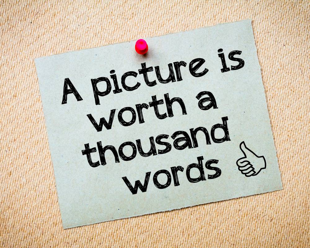
You’ve probably heard the phrase a picture is worth a thousand words. Well, you’ve heard it because it’s true. A thousand words is a lot of words, but they need to be the correct words, if they’re interpreting a thousand wrong words then you’re going to need to reassess your visual branding!
Imagery
When deciding on imagery there are generally a few key rules to decide upon. The main one would be to decide what is going to be the ‘hero’ of your shot. The hero is the centrepiece. Some brands will have their products as the centrepiece of the imagery, some will have people. Other brands may highlight the application of their product or service being put into practice, or others may highlight their customers or clients. Identify who or what your key hero is, and make them the centrepiece of your brand imagery. This may differ from campaign to campaign, but within the boundaries of an individual campaign, we want there to be a consistent tone.
Another critical factor in imagery is the degree of authenticity that it reflects. People don’t want to feel like they’re being lied to. If your imagery suggests that is the case, it won’t be well received. Have you ever seen someone with a bursting smile whilst they’re doing some sprint training, or if they’re eating a salad? Maybe you have, but chances are most people don’t react like that. Try and make your imagery reflect the action that is taking place as best you can.
Finally, are you using stock imagery, or creating your own original imagery? While the main difference here is probably felt in your wallet, you should still ensure that when you choose one or the other, there is a consistent feel. You want to create some rules for your imagery and stick by them. These rules apply for both your own images and for stock images. These rules might look something like this; Are your images abstract or literal, what is the ‘hero’ of the image, what colour tones are you using, are you using text anywhere in your imagery?
Identify some rules and boundaries and stay within the confines of them.
Iconography
Icons can be seen as stylistic extensions of the brand from a visual perspective. Different from a logo which represents your brand as a whole, icons are typically minimalist. They normally represent a function or object. Icons are great at breaking down language, and are highly communicative, so serve a useful purpose. Especially from a UX perspective when you can have large volumes of information via text. Icons display a clear message, provide balance to design, and can be great for CTA’s.
Due to their use from a UX perspective, icons are generally ‘universal’. Each icon is distinct and unique enough to clearly represent one thing, even across language barriers. They are also generally quite minimalist. You do want to keep consistency amongst your usage of icons, so there are again a few rules that you should generally look to follow.
Iconography Rules
Form is one of the main rules in iconography. The form represents the underlying structure of an icon and is largely maths/geometry based. Typically each icon can be broken down into major shapes, sizes, and angles. Try and keep this same form throughout your design, things like using consistent 45* angles, a similar line weighting, using hard or soft rounded edges, and similar core shapes to represent distinct objects or features.
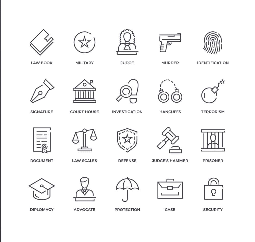
Some common symbols used in legal iconography include things like scales, quills, pillars, and books. Each of these represent something, from power, justice, intellect, and balance. Choosing certain icons to feature in your branding can give subtle hints as to what your brand is about. It helps to highlight your key messaging.
Sharp edges and thick lines might represent strength and power, whilst softer rounded edges can display harmony, balance, and flexibility. It’s important to assess the goals and the messaging you want to convey and apply those rules unanimously across all your iconography.
Final Thoughts
When it comes to symbology, and your brand’s visual identity it is important to maintain a consistent tone. This is hugely significantly from a visual perspective, as imagery is generally what captures the most of your audience’s attention. Maintaining and keeping to certain rules within your chosen imagery is crucial, but there is no reason why those rules can’t be creative in their own right.
The same applies for your iconography. Both iconography and imagery are visually stimulating throughout your branding, and with a consistent tone and feel, an audience will begin to grasp a certain feel for your brand. Certain icons and images can give off subtle impressions, whether abstract or literal. These can be strong indicators of what you stand for!
If you’re looking for more information about legal branding, please contact us here for a free consultation.