

Marketers all agree that great copy is nothing without the right imagery, and yet somehow 90% of blog, social and website imagery continues to be a rushed afterthought that communicates absolutely nothing unique or interesting about the brand.
One explanation for this is that you simply cannot teach good taste. You either have an eye for selecting great imagery or you don’t.
Bollocks.
Of course you can teach good taste. Just compare my wardrobe now with the one I inflicted upon the world prior to my girlfriend teaching me that grown men should never wear t-shirts with tie-dye or disney characters. I can’t pretend to understand why she is right (what’s not to love about a florescent Mickey Mouse?) but now I understand the rules, and that’s enough.
So here are some rules I’ve learnt for choosing the right imagery. You don’t need to particularly agree with them, you don’t even need to understand them, you just need to follow them.
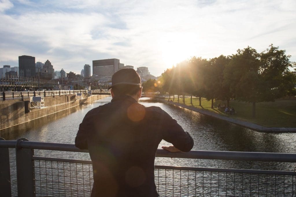
Rule 1 – keep it candid
Your subjects need to appear 100% in the moment, or how can you expect the reader to believe the image or feel an emotion?
This is the problem with most stock photography – painted smiles and lifeless eyes that do nothing to suggest the moment being portrayed in the image is real.

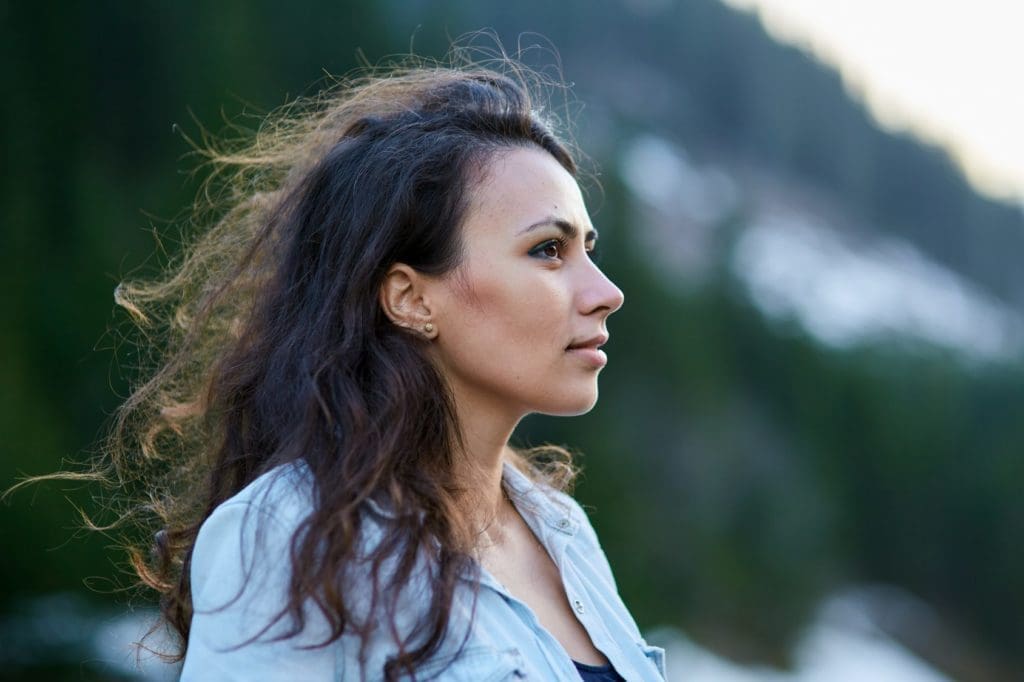
Rule 2 – look away
This ties in with the first rule. After all, how can someone believe the image is real if the subject is looking directly at the camera? The person needs to be lost in the moment, seemingly oblivious to the photo being taken.
This also helps the viewer to imagine that they themselves are the person in the image, particularly if the face of the subject is out of view or obscured.
Rule 3 – consider softer lighting
Soft light reduces harsh shadow lines or sharp transitions and ensures a more gradual and flattering transition from light to dark. This is the reason images shot at dawn and dusk often sell better than those shot in the middle of the day.
Rule 4 – keep it on-brand and consistent
If people are to immediately associate the image with your brand then it must adhere to clear guidelines. Should it be serious or informal? Energetic or relaxed? Accessible or aspirational? Modern or traditional?
What is the brand’s colour palette and how will you ensure this is respected in the imagery? Will you use a particular filter to achieve consistency, or can your designer edit the imagery to bring out your key brand colours?
Rule 5 – capture an emotion
It’s okay for the image to be obscure in literal terms, as long as it is crystal clear in emotion. What I mean is that in many instances the image need not specifically portray the product, but it must portray the specific feeling you want the product associated with.

Rule 6 – think about the relevance of the subject
The person within the image can either represent your product/service, or your target audience, usually you would favour the latter. This may be an aspirational version of your audience, but it still needs to be within the realms of reality or the viewer will be unable to project themselves into the scenario being portrayed, and that’s precisely the point of the image.
Rule 7 – Rule of thirds
The rule of thirds is one of the pillars of great photography and something to look out for when selecting your images.
It could not be more simple – imagine you place two evenly spaced horizontal lines and vertical lines on your image. The goal of the photographer is to place the subject on one of the four crosshairs, and they will choose which crosshair by whichever will make the more interesting image. For example, if the image is of the sea and there are stunning clouds then the photographer will probably choose to place the subject on one of the bottom two crosshairs, but if they wanted to show great crashing waves then they would place the subject on one of the top two crosshairs.
When choosing your image you should look for this rule and feel confident that the photographer has placed your key subject in this optimal position. Here’s a great video by the photographer Mike Browne explaining the concept…
Rule of thirds from Mike Browne on Vimeo.