

When you think of branding for law firms, a couple of things likely spring to mind. A sensible navy colour palette. A pair of scales or a gavel. Pretty uninspiring stuff, right? We’re not bashing these legal market staples. They’re widely used for a reason. All we’re saying is, branding for law firms doesn’t have to be so… well… boring.
Maybe the average law firm hasn’t put much stock into their branding because they don’t see the value in it. They’re not alone. Most B2B professional service firms tend to assume branding won’t have as much impact as B2C.
Intensified market competition means that, more than ever, law firms are struggling to stand out from the rest of the competition. Branding is one of the best tools your firm has in its arsenal. A distinctive, unique set of branding (with no blues or gavels, thank you very much) firmly sets you apart from your bog-standard firms.
To prove that not every firm has boring branding, we’ve compiled a few of our favourite firms together. These firms have really stepped up their brand with firm values and exciting visuals that strongly convey who they are and what they stand for.
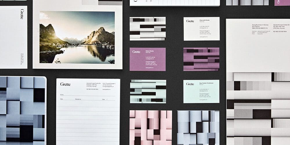
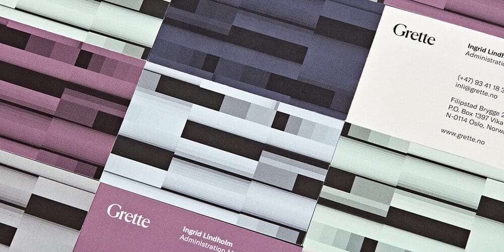
Grette by Snøhetta
A modern spin on the traditional. Design agency Snøhetta took law firm Grette and transformed its visual identity. Their visual overhaul was far more than just a new lick of paint, though. Every element of the design is backed up by Grette’s ethos, values and company culture.
As a firm, Grette provides legal advice based on deliberative dialogues. They recognise each member of their team as an individual and highlight their uniqueness and strengths. Their holistic approach to complex legal issues within a range of sectors and disciplines is at the core of their success.
Grette’s updated design reflects all of these values. Their collective effort and respect for the individual shine through with the new visual identity. A truly unique aspect of this design is their visualisation tool that reflects different employee sectors, disciplines and characteristics.
Their new logo and typeface is a sans-serif font that lies between two classic typography styles: European grotesques and American gothic typefaces. The different typographies can be used interchangeably or isolated – again echoing an idea of individuality and collectiveness.
Likewise, their colour palette is just as reflective of their ethos of individuality and collectiveness. A range of cool greys is paired with subdued shades of burgundy and aubergine in a subtle and elegant palette.
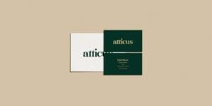
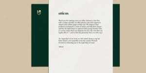
Atticus by Lazaris
Exciting branding isn’t just reserved for big-city firms. The little guy can get in on the action too! And that’s exactly what Atticus did. They’re a new sort of firm that’s looking to shake up the legal market in America and change how things are done. Atticus specialises in referring clients to the right firm (or non-profit) that suits their exact needs. Their modern approach means they provide rapid, transparent and expert advice every time.
As such, they combine their small-town, wholesome and personable feel with the easy accessibility of modern technology. Lazaris took these core elements of their branding and implemented them into their visual design. Every aspect was built to very their modern approach and confident, successful, small-town feel.
The typeface – a bold, rounded sans-serif font – conveys these juxtapositions effortlessly. The basis of a sans-serif font suggests an old-school, traditional vibe. The weighted boldness of the lettering has a modern, trendy feel that represents their contemporary communication.
Alongside this, the crest-like feel of the logo furthers this feeling of small-town tradition and integrity without feeling too stuffy or rigid. The colour palette also helps lift the brand from an ordinary firm with a calming yet contemporary forest green paired with a soft, subtle beige and touches of gold. It creates a premium feel without alienating the customer base.
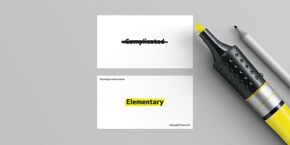
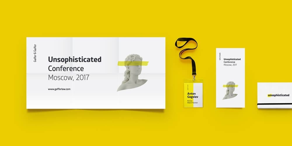
Gaffer & Gaffer by Aleksey Busygin
Gaffer & Graffer is proving that you can break the mould with branding for law firms. It helps that their company culture, values and ethos breaks the mould too. They’re a firm of legal experts that’s full of personality and business-oriented solutions that don’t faff around.
Both their logo and colour palette represents their guiding principle – to find clear, simple solutions in a complicated space. They aim to keep their solutions so simple that anyone could understand them. Additionally, the highlighter yellow and white paired with the simplicity of their logo breaks the mould of the average grey suit. There’s nothing corporate or average about their firm, and equally, there’s nothing corporate about their branding.
Every element of the visual identity is stark, clear and easy to understand. As if someone’s erased all the confusing bits and highlighted the important stuff. It conveys Gaffer & Gaffer’s ethos in a single glance.
Branding for law firms is the single most powerful way to convey everything you stands for in just one glance. If your firm’s branding isn’t quite up to scratch, contact us today for a free consultation.