

When you’re setting up your law firm, logo design is probably the last thing on your mind. A lot goes into setting up a business and there are a million-and-one things to get done with not enough hours in the day to do them. Often, logo design for law firms falls down the cracks and gets forgotten about.
That shouldn’t be the case, though! Your logo design is one of the most defining aspects of your business to potential clients. In just one glance, a client will make a thousand snap subliminal assumptions about your brand. Is it modern and forward-thinking? Traditional and reliable? Out-of-the-box and creative? Friendly? Domineering? Your logo design conveys all of this and more. It’s essential to pay this aspect of your brand close attention and treat it with the care it deserves. You’ll be seeing it everywhere, after all!
In our previous blog post, we walked you through some of our favourite instances of logo design for law firms. This time, we thought we’d show you how we went about designing a logo for one of our clients.
Colour psychology and logo design for law firms
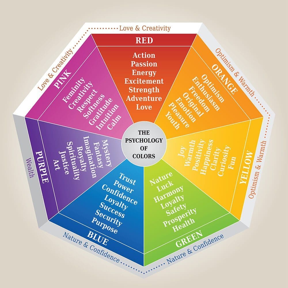
Before we get into all our different designs, it’s important to cover the basics. Colour psychology is the study of how certain tones influence and affect human behaviour. Colour’s influence on our behaviour isn’t obvious and is usually quite subliminal. It’s so much more than ‘red equals angry’ or ‘green equals envy.’ Let’s head back to English class – the curtains are blue for a reason! And the science can tell you why…
Colour is the culmination of all the light we can’t see. When we can’t see that light, we’re left with whatever’s left. The light that’s left is what stimulates the cone cells in our eyes (they hang out in the back of our retinas) and that’s how we see colour!
Our retinas have three different kinds of cone cells in them. Each cone cell reacts differently to ranges of light:
- Blue cone cells react to short wavelengths of light.
- Green cone cells react to medium wavelengths of light.
- Red cone cells react to long wavelengths of light.
Each of these cone cells has a different level of sensitivity, too. These levels of sensitivity have a huge impact on how we view the world around us. Red cone cells are the most sensitive. Green cone cells are middlingly sensitive. Blue cone cells are the least sensitive.
You’re probably used to seeing logo design for law firms that heavily feature the colour blue. As we just learnt, blue cone cells are the least sensitive and therefore are the most calming colour to look at. The colour blue also holds connotations of the sky and ocean – both calming and peaceful images. Blue also connotes feelings of trust, stability, dignity and tradition. It’s no wonder law firms flock to the colour for their logo design. They want their clients to trust them, stay calm despite their (likely) stressful situation and associate the firm with tradition and intelligence.
Logo design for law firms to stand out from the crowd
We believe that every law firm is different. Every law firm has a different culture. Every law firm has different values. No two firms are the same and won’t feel the same to work with. So, why does every logo design for law firms look the same?
No gavels or scales feature in our logos. Our clients are unique and we shape each logo to the distinctive vibe of their firm. Take unnamed client number 1, for example. This client was not your typical suit. They were bold and didn’t ever hesitate. They had a strong interest in sports and teamwork with a strong dislike of corporate mundanity. They were as authentic as they come. Their law firm was built upon these values and we created a logo to reflect that.
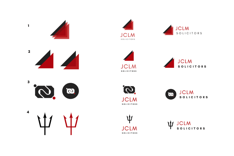
The above logo designs are the designs we decided not to move forward with. As you can see, there’s plenty of different ways to convey a brand’s values – no scales or blue required!
Colour choice
The two main colours used throughout the logo design process was a blue-toned red (#B40000) and a dark grey (#262626). As a blue-toned red, it feels more grounded and esteemed than an orange-red might, plus it overcomes the budget connotations of orange. It’s a nod to the client being unconventional and exciting in what can be a dull space. An off-black is less intense than #000000. It adds a nice weight and authority to the palette and suggests that the client is grounded, professional and serious about what they do.
Typeface
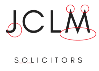
The typeface also conveys a lot about the brand’s values and is an important part of logo design for law firms. The stylised features on the characters, particularly on the ‘M’, really complements the brand personality and values. The combination of sharp points and rounded shapes work perfectly together to suggest ‘cutting edge’ but also approachable. The kerning on ‘solicitors’ has been increased by quite a bit to open up the logo and combat any heaviness that might occur with the combination of Crimson and Charcoal.
Symbolism
For this client, we wanted to get across their no-nonsense approach, loyalty to their clients and fearless nature. With the layered triangles, we wanted to convey a sense of strength (as a triangle is the strongest, most robust shape) and stability combined with a fearless colour palette. With the knot, we wanted to symbolise the client’s dedication to their own clients and the togetherness that is deeply embedded into their company culture. With the pitchfork, we wanted to bring in the client’s love of a particular football club and continue that association with fearlessness and teamwork.
Does your firm need a logo that reflects its culture and values? Contact us for a free consultation with one of our marketing experts to discover how we can help elevate your brand with our expertise.