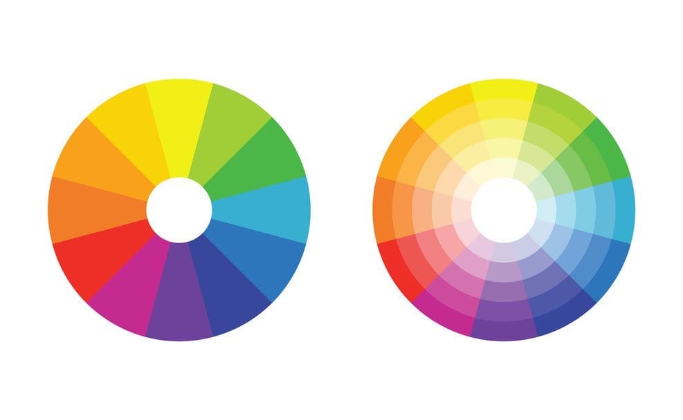
Light waves have a frequency. The word we use to describe frequency is colour.
In life, these wave frequencies, or colours, play a really big role. After firing through our retinas as electrical impulses they work they way into the hypothalamus which manages lots of things like stress levels, sleep patterns, emotions and appetite. Colour affects all this stuff.
It’s therefore little surprise that in marketing we have to pay a lot of attention to colours. Whether it’s colour of a product, website or piece of packaging, that colour not only forms a certain visual identity for the brand, but also evokes particular feelings within us.
Some of this is a physical reaction, which we learn all about in GCSE’s… For example, the red cone cells in the eye are the most sensitive to light and red focuses behind the retina which forces the lens to grow more convex to pull it forward, which results in us perceiving red objects moving towards us. These factors may explain why red is highly visible and captures attention.
Meanwhile the opposite principles apply to blue, which is probably why it’s perceived as being a calming colour.
However, as tempting as it is to reduce colour to a few simple principles, in truth this is only a tiny part of a far more interesting picture.
You see colour, as with everything, is about context:
- First, the lighting context – The light that illuminates an object will impact the colour of the object. For example, if a blue light is shining on a red object, then the red object will actually turn very dark as while the object is still red, there’s no red light for it to reflect. In fact it would turn black if you could control the environment enough. That’s extreme and in most spaces there is a broader spectrum of light, but that light will still impact the colours that you see. A common example is in office settings where typically people use very white lights as they help us maintain concentration, but you wouldn’t necessarily want that clinical lighting at home. Instead in your lounge you’re likely to use a warmer, softer light, giving objects a slightly yellow tinge.
- The things surrounding the object in question – If you want to make a colour stand out then place it within or alongside the colour opposite it on the colour wheel. Red roses, for example, will look even redder on green grass, while if you stuck them on an orange background they’d lose nearly all their energy.


- Then there’s the cultural context – a nice example of this in the western world is the way we associate blue with masculinity; not so long ago little boys were actually dressed in pink and little girls in blue! Our associations to the reverse are nothing more than a recent social construct. Every colour comes with a tonne of this cultural baggage, and it’s our job as marketers to rummage through it so that it supports rather than detracts from our message.
- Finally, there’s the broader context of the brand narrative – our office, for example, is a bit like something out of MadMen. We’ve tried to create an environment that fuses the traditional principles of marketing with the new, digital world and create an atmosphere for strategic and creative thinking, by which I mean we always have a fully stocked drinks globe. On my desk sits an old fashioned bankers lamp, which is of course green. Green is not an official part of our colour palette, but within that specific context, what other colour could it be?
This is why colour selection and design cannot be done in isolation. The person determining the colour of an object, be it physical or virtual, needs to not only appreciate the visual context in which this thing will exist, but have an intimate understanding of the broader story being told.
Only then will we see your brand’s true colours.
Until next time,
Dan


