

Your nonprofit’s website is the window to your cause and the doorway to donations, so getting it right is crucial. Many (many) things must be considered when it comes to building the perfect website for your charity, some more important than others, but each with its own role to play. You can learn more about web design in our ultimate guide here, but in the meantime, check out these nonprofit websites to discover outstanding web design in action.
Making moves
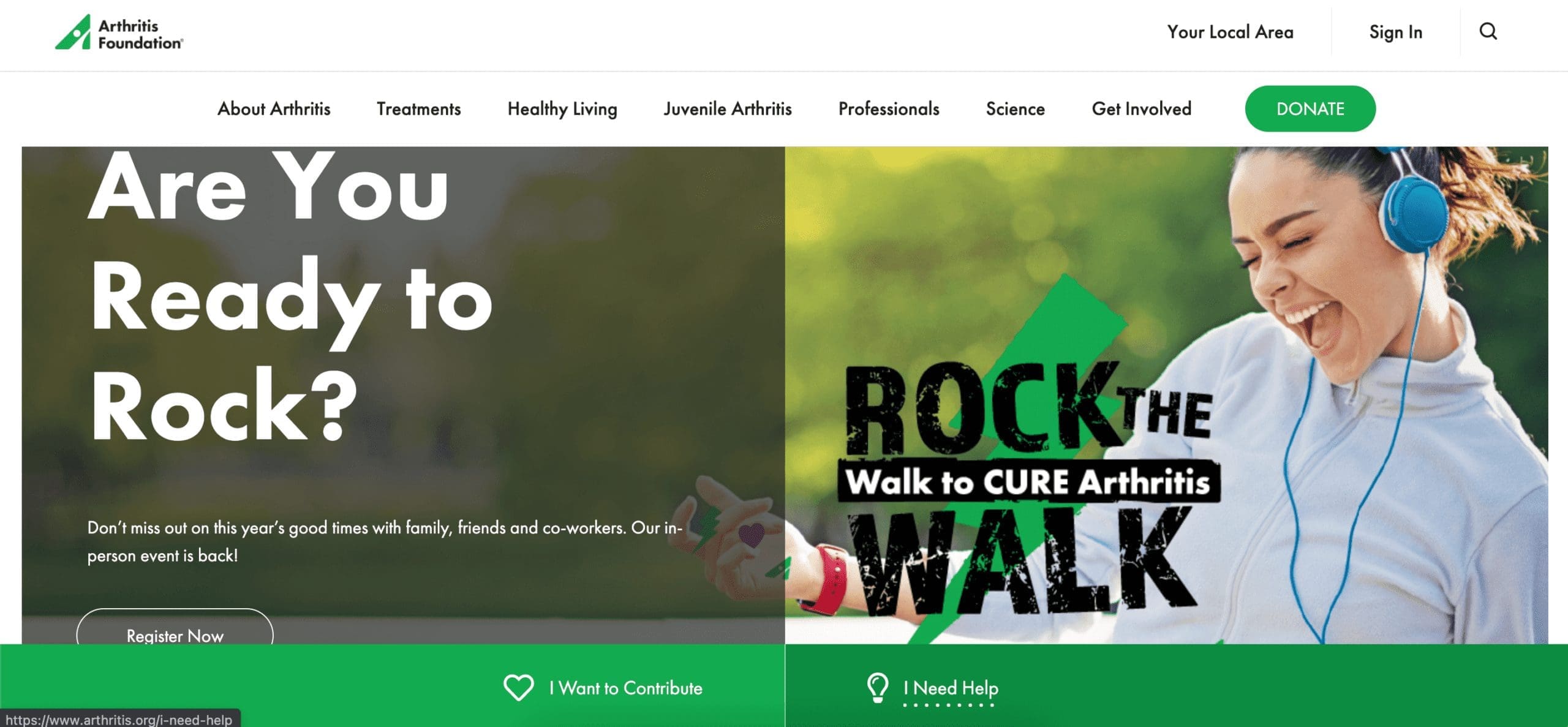
The Arthritis Foundation shows us how simple animation can engage users and draw their attention to key information. From a hero carousel with animated transitions to simple (yet highly effective) button hover effects, The Arthritis Foundation successfully uses movement and on-brand, eye-catching colours to highlight CTAs (call to actions), and create a cohesive feel that encourages users to continue their journey through the site.
Let the numbers do the talking
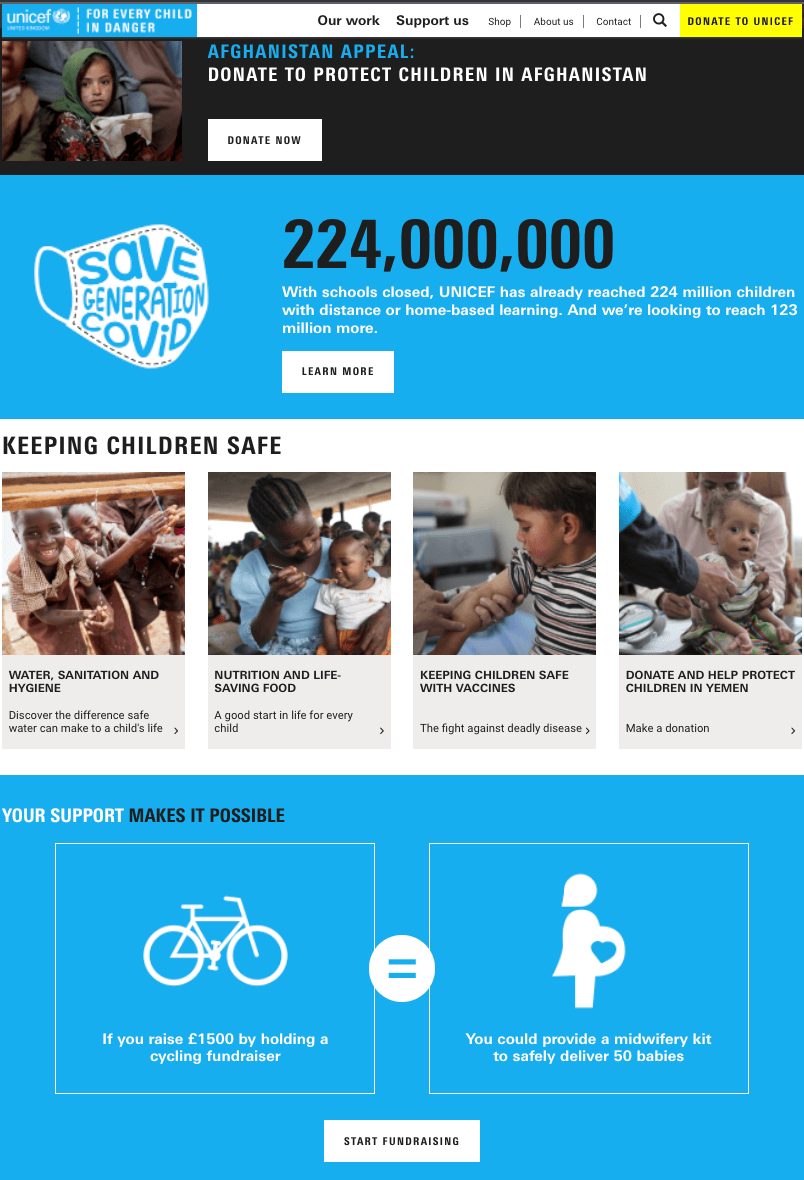
Unicef UK demonstrates the value of numbers. Whilst saying “holding a fundraiser can help us to provide midwifery kits” is great, letting the numbers do the talking is the most effective way to encourage action by amplifying the impact your audience’s support will have. Again, Unicef UK makes use of their brand colours to break up text and draw attention to key information and drive users to help their cause with impactful figures and relevant imagery accompanied by actionable CTAs.
Up close and personal
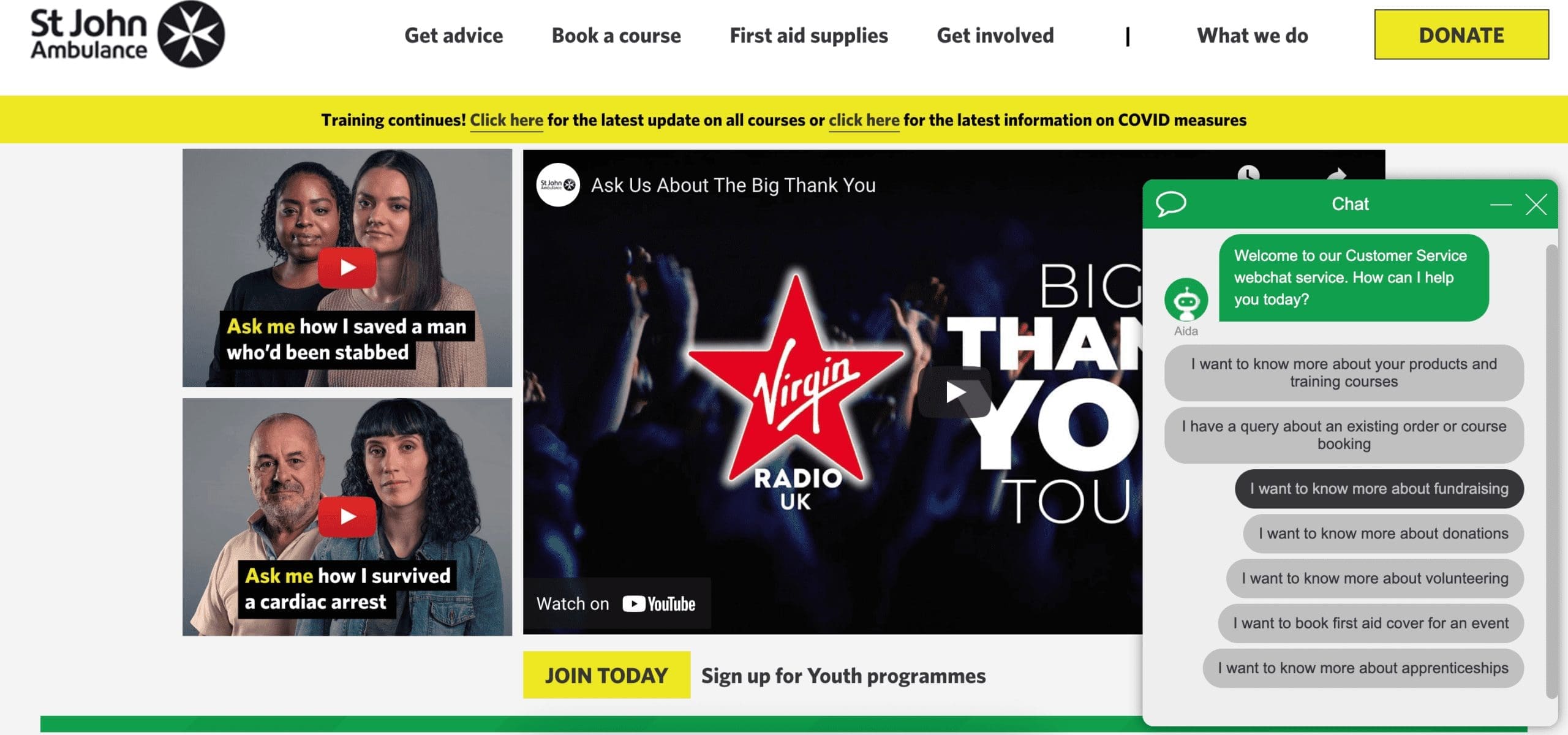
St John Ambulance speaks directly to their audience with the help of personal video stories and their very own chatbot, Aida. This UK charity is leading the way with video marketing, proving that actions really do speak louder than words. By demonstrating the impact of their work using real people, St John Ambulance makes their work appear more relevant to their audience and allows them to connect with the stories on a personal level, compelling them to take action.
Their site is packed with videos that aid the communication of their message and help to drum up invaluable support from the public. With an intuitive search function, an array of helpful resources and a user-friendly interface, this on-brand charity website not only makes it easy for users to offer their support but more importantly, gives them a reason to.
To the point
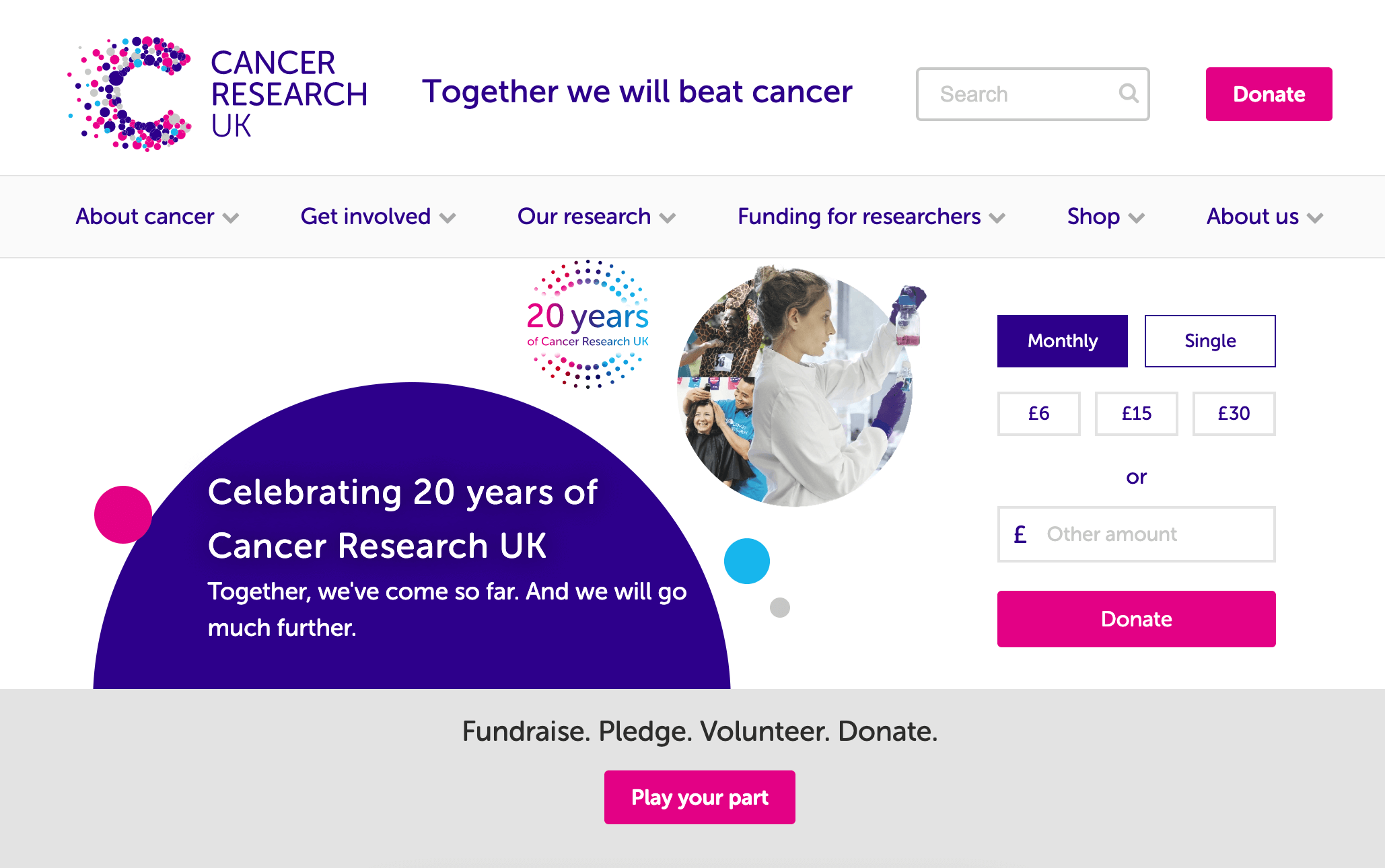
Direct language, snappy statements and a simple way to donate. Cancer Research UK does not play around when it comes to driving support from its audience. Their built-in donation form allows users full flexibility so they can donate exactly what they want when they want. With frequent CTAs advertising various ways for users to support the charity and a range of informative resources readily available, the Cancer Research UK website successfully removes barriers to donation and heightens desire to support their charity.
A story to tell
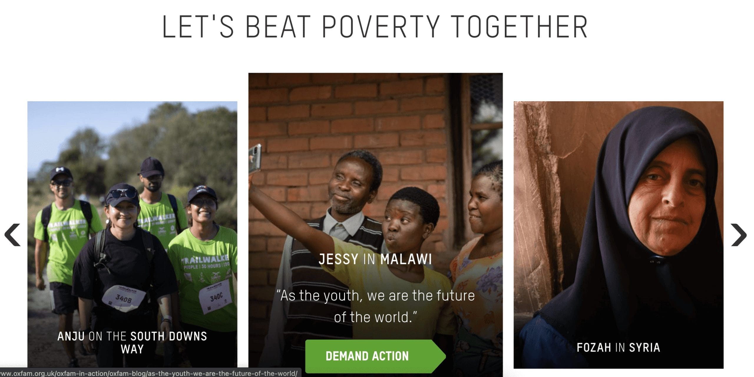
Oxfam makes its cause seem that much more real by sharing beneficiaries’ personal stories. This not only helps to make the impacts of support more tangible but also allows their audience to connect with them on a more personal level, making them feel more compelled to help.
Looking for help with your nonprofit’s site? Get in touch now to organise your free consultation and discover how we can help you build a site that drives donations, communicates your cause and makes your goals a reality.