

Colour is the first thing an audience notices. It can arouse emotions, reinforce messages, confuse, irritate and captivate.
Some of this is personal interpretation, but much of the way we perceive colour is shared between all of us. As marketers these rules can help us to create content that is not only visually pleasing and engaging, but also to help improve legibility and prioritise certain components over others. The rules broadly fall into two categories:
The cultural – different groups and nationalities attach different meanings and significance to each colour, often based on centuries of cultural and social associations. A colour which means one thing among one group of people could mean precisely the opposite to another.
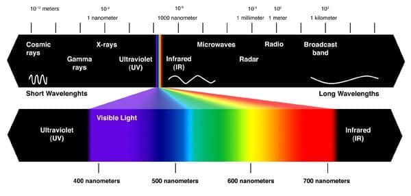
The scientific – colour is an electromagnetic energy. It is the way light is refracted off an object and doesn’t actually exist outside of our minds. The colour we see isn’t the actual colour of the thing in question. In fact it’s every colour APART from the colour that you see. The light waves that aren’t absorbed but refracted then stimulate cone cells at that back of your retina. There are three types of these cone cells and they each react to different ranges of light:
- Blue – short wavelengths
- Green – medium wavelengths
- Red – long wavelengths
The red cone cells are the most sensitive to light, then green, and blue are the least sensitive. These different levels of sensitivity have profound implications on the way we view the world and, indeed, the way we view advertising.
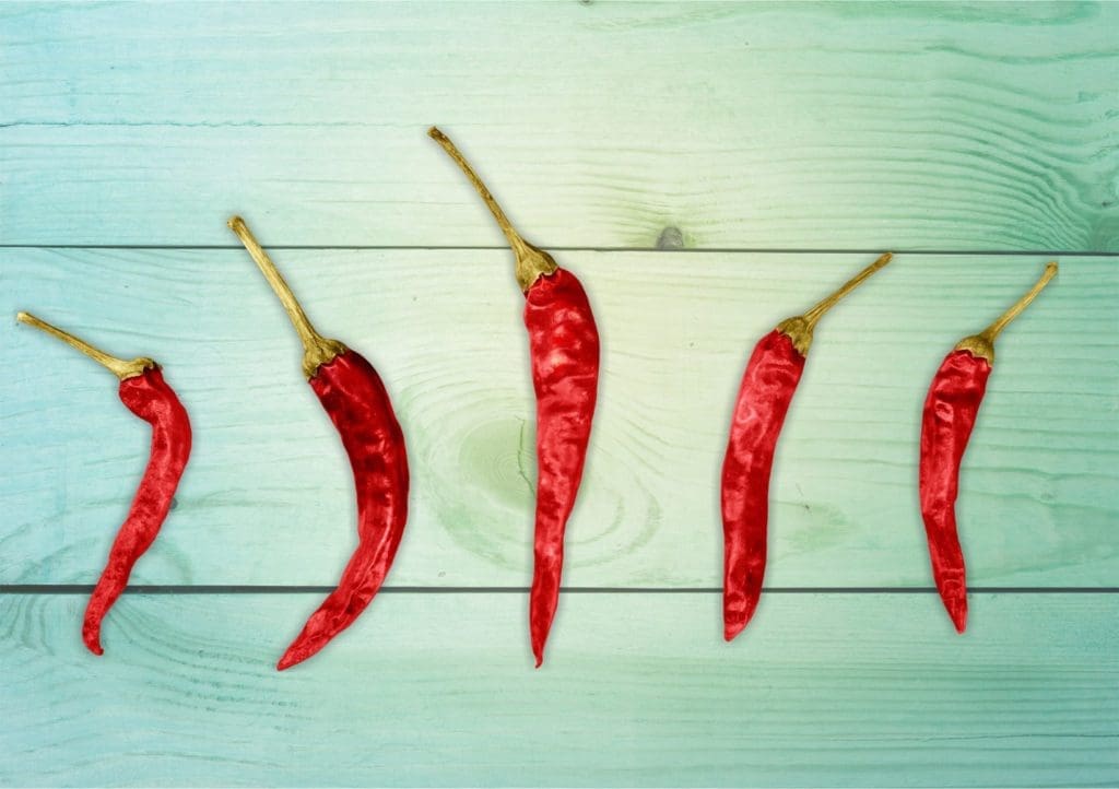
Red:
Culture – Red is a colour of emotion – love, anger, heartache, violence and passion. It is used to signal “Stop” and “Emergency”. It is the world’s second favourite colour and in surveys females tend to be drawn to berry reds (blue reds) while men tend to be drawn to tomato reds (yellow reds).
Science – as explained in the introduction, the red cone cells are the most sensitive to light. Furthermore, red focuses behind the retina which forces the lens to grow more convex to pull it forward, which results in us perceiving red objects moving forwards. These factors may explain why red is highly visible and captures attention.
Blue:
Culture – blue is the most popular colour in the world and most common colour within corporate identities. It is the colour of the sea and sky, and its meaning is dependent on shade; dark blue signals trust, dignity, strength, authority, tradition, whilst light blue is associated with peace and tranquility.
Science – blue is the opposite of red. The blue cone cells in the eye are the least sensitive to light, and furthermore the short wavelengths that trigger the blue cone cells are sharply refracted by the eyes which causes the lens to flatten and to push the image back, resulting in blue areas appearing to recede. This may explain why blue is perceived as being a calming colour.

Green
Culture – green is used to signal “Go” and safety. It represents fertility and life., and has now transcended colour and become a verb (to “be green”), synonymous with ecology and environmentalism.
Science – the green cone cells are less sensitive than the red cone cells but more sensitive than blue cone cells, giving it a moderate visibility. There are more shades of green than any other colour.

Yellow
Culture – yellow is the colour of optimism, happiness, creativity and sunshine. It is the colour of the sun and radiates energy, and is often used for high visibility clothing to attract attention. However, if you add a bit of black and it turns a dingy green, representing illness and betrayal.
Science – yellow is the most luminous colour on the spectrum. While there are no yellow cones as such, seeing yellow is what happens when both the red and green cones are triggered (the most sensitive and second most sensitive), hence why it is so bright! In fact used to excess it can become fatiguing and an irritant.

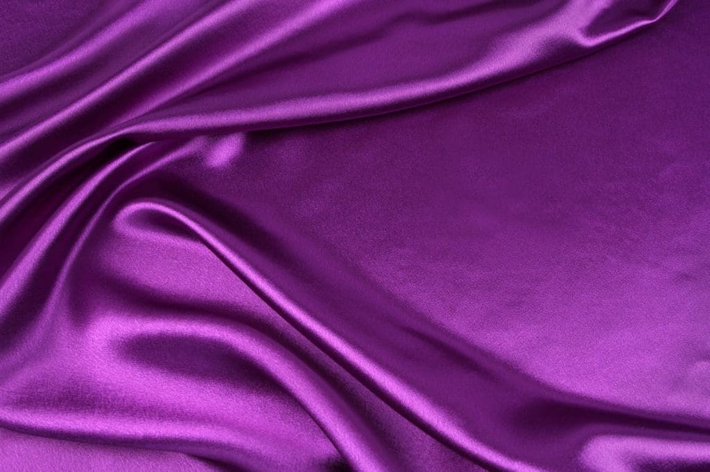
Purple
Culture – purple has historically been rare and expensive. In fact the earliest purple dyes required around 12,000 selfish to extract enough dye for one garment, hence why it was associated with royalty and wealth. The positive associations include intelligence and dignity, while the negative connotations are decadence and arrogance.
Science – despite triggering the blue cone cells which are the least sensitive, purple is actually the most powerful colour in terms of energy as it is made up of the shortest wavelengths of all the visible colours (the shorter the wavelength, the more are packed in and the smaller area they can target, hence more energy). The reason why the blue cone cells are actually less sensitive is because there are far fewer of them then green and red!
Orange
Culture – Orange is energetic, exciting and vibrant, but it can also be seen as cheap and lacking substance. At it’s brightest, orange is a polarising colour. People either love it or hate it. Darker oranges, however, such as terracotta or cayenne, can be seen as a little more tasteful as they communicate home, warmth and comfort. Likewise lighter oranges, such as salmon or melon can be perceived soothing and healthy.
Science – orange is a combination of red and yellow, which for the reasons previously explained makes the retina highly sensitive to it and explains why it is regularly used in high visibility clothing.

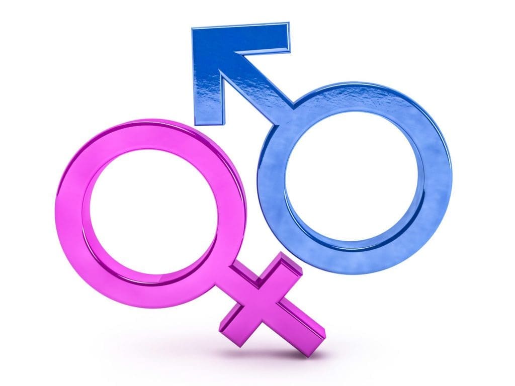
Pink:
Culture – perhaps no other colour carries such strong gender associations as pink, but these are actually a very modern development. Until the early 20th century it was commonplace for little boys to be dressed in pink and girls in blue. Like orange, a bright pink can be considered bad taste and childish depending on the context, while softer shades are generally seen as more tasteful.
Science – unlike every other colour we’ve discussed, pink doesn’t actually exist on the colour spectrum. It is a combination of red and white, and to be perceived it needs the red cone cells to react fully and the green and blue cone cells to be partially activated (as the combination of all three creates white).
All about context:
While colours may have some strong associations of their own, in practice it almost always depends on the context. Red, for example, will stand out strongly on black, while On white it looks a little duller, and on orange it loses nearly all its energy.
There are a few general rules to choosing the right colour combinations:
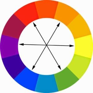
Contrast – contrast aids visibility, so is particularly important with text but can also be used to draw attention to certain elements of an image. It is achieved by selecting complimentary colours, which are found on opposing sides of the colour wheel. For particular vibrancy you can place an equilateral triangle on the colour wheel to create highly contrasting colour triads, the most basic of which being red, yellow and blue. However, too many contrasting colours can become jarring and leaves the user with little idea of where to look first.
Harmonising – colours that are next to each other in the colour wheel are said to be harmonising. As opposed to contrasting colours, they tend to look comfortable with one another, although their values (lightness and darkness) need to be sufficiently apart to avoid appearing washed out.
In the eye of the beholder
Ultimately, what constitutes the right colour is down to the individual’s point of view. Our cultural associations often come down to personal experience and who is to say that what I even see as red, for example, is what anyone else sees as red? Optical illusions, such as the blue and black dress that went viral last year, show how objects have colours that observers perceive differently. There are no hard and fast rules and so it’s down to the designer to assess how best to reconcile the brand and messaging with the tastes of the target audience.
Dan